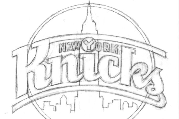
One of the biggest obstacles I have found in designing logos is overcoming the theory that everyone and their mother should like a logo. If you are creating a mark for a new streaming music service that targets hipsters do you really want your mom to like the logo as much as you do? The design by committee approach has derailed many a design over the course of history, but it’s always interesting to see the process unfold even with a big brand.
Michael Doret designed the current New York Knicks logo but a look at his alternate concepts leads me to believe that the committee approach prevailed and the generic ‘basketball plus text’ logo was born. The Definitive NBA Logo Rankings keep the Knicks buried near the bottom of the logo pile with the other ‘basketball plus text’ designs. I happen to agree with the Definitive article for the most part (Washington should get more cred) but it looks like most of the design bottom feeders in the NBA all suffer from the vanilla mediocrity of staying too conservative. On the bright side, most of the alternate and token logos are wonderful.
I like to believe that a designer should approach a logo with one person in mind. Create a mark that would make that one person wear the logo on their shirt with pride and you’ve found success. If the committee drags it down to the masses, so be it. There is a reason Vanilla is the most popular flavor of ice cream.
