Midwest Research University Network

About This Project
THE BRIEF
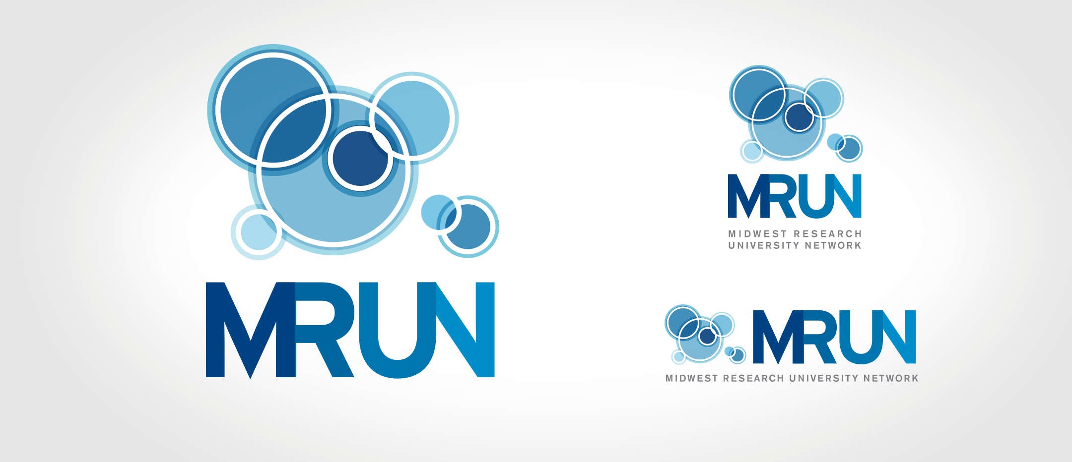
Design a logo that represents the interconnected research universities of the Midwest. Keep the look professional, modern and scientific.
THE RESULTS
A little bit petri dish, a dash of charting and a sprinkling of scientific aqua colors and a logo was born. The final logo was well received by the participating university representatives which goes to show that design can bridge borders – to an extent. The website was branded and painted with the logo elements on a sterile white background to keep it clean.


