Portfolio | Lucky Creative
0
archive,post-type-archive,post-type-archive-portfolio_page,ajax_fade,page_not_loaded,,vertical_menu_enabled,side_area_uncovered_from_content,qode-child-theme-ver-1.0.0,qode-theme-ver-13.5,qode-theme-bridge,disabled_footer_top,wpb-js-composer js-comp-ver-6.9.0,vc_responsive

Archive


THE BRIEF

Being lucky means sharing the luck with others. The Ladies of Notre Dame and St. Mary’s College are some true do-gooders. One kindness deserves another, so Lucky Creative donated a logo design and website design to the lucky ladies for 2014. The goal was to freshen up the image while retaining the organization’s roots in order to appeal to the next generation of do-gooders.


THE RESULTS

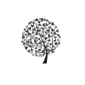
Keeping the organizations roots became a literal translation for the logo and a new WordPress website allows the group to keep their online content fresh. The new website added interactivity to the content including an event calendar to highlight their activities and it never hurts to sprinkle a little Facebook into the mix.


THE BRIEF

Sometimes it takes a long look at your collective work to notice themes. I think that the Mail Monkey logo for Aberdean hits a few of my common threads. Punchy colors (orange as a sub-theme), playful animals and block type start a common thread. If you are looking for a logo with punch, give me a shout.


THE RESULTS

A full set of wonderful logos and icons that make your inbox a happy place. No more viagra emails!


THE BRIEF

Design a logo and website for the annual celebration of all things ‘B.’ Well, a lot of B things anyway, it wasn’t the letter of the day.


THE RESULTS

A fresh illustration blending the cycling with the musical overtones drove the logo design. From there, the WordPress website received an overhaul to speak with the four major visitor segments. The new sitemap condensed the content into user-friendly sections and the interface became responsive to lend a big hand to mobile users. Sick photos and a paint job didn’t hurt, either.


THE BRIEF

Design a logo and T-shirt for the Pauliefest benefit.


THE RESULTS

Keeping the musical spirit in tact with a trendy type treatment and a dash of grunge. A perfect musician’s medley.


THE BRIEF

Design a logo, poster and postcard for the performance of 2nd Skin.


THE RESULTS

A medley of action shots juxtaposed over unwavering trees created a visual balance for the performance while piquing interest in the event. Modern dance has a lot of risk-taking and the design did the same.


THE BRIEF

I was contacted by Runner’s Gate to fix some of the errors on their website. After looking through the code it was obvious that there were enough problems with the site that the previous developer walked away without finishing the website. I offered to design and build a new website to highlight their products and expertise instead of trying to salvage the old site.


THE RESULTS

A fresh look that reflects the textures and colors of the running shoes and a splash of personality. Built from scratch with love and care from beginning to end. The website uses a WordPress website to aggregate content from the Runner’s Gate newsletter and Facebook promotions.


THE BRIEF

Design a new advertising campaign to promote the Sandbox Children’s Museum. Present the space as a fun place for children to learn with grown-up appeal.


THE RESULTS

I used photography of children playing at the museum intertwined with some of my own imaginary illustrations to illuminate the scene. Each ad is dual purpose, highlighting an attraction within the museum and simultaneously promoting an upcoming event. Two birds, one stone and a series of advertisements that appeal to parents and kids alike.


THE BRIEF

Design a logo that represents the interconnected research universities of the Midwest. Keep the look professional, modern and scientific.


THE RESULTS

A little bit petri dish, a dash of charting and a sprinkling of scientific aqua colors and a logo was born. The final logo was well received by the participating university representatives which goes to show that design can bridge borders – to an extent. The website was branded and painted with the logo elements on a sterile white background to keep it clean.


THE BRIEF

Design a logo and website for Beaverdale Bicycles that sells to the hardcore, beer-drinking cyclist. Have some fun along the way.


THE RESULTS

Are beavers on bicycles fun? I would argue yes. The logo design has been propagated across many a t-shirt and continues to have a screaming good time. The website design was well received but all good things come to an end.


THE BRIEF

Go medieval on a website interface for a Massive Online Battle Arena called Dragons & Titans.


THE RESULTS

Dragons, fire, ice and ancient flavor throughout. The interface of the website lets users dive right into the game or peak around the backstory and community content. Take a look for yourself at www.dragonsandtitans.com


THE BRIEF

Design a logo, website and marketing materials for a start-up salon in Madison, Wisconsin.  Reflect the personality of the owner and keep things punchy.


THE RESULTS

Bright orange shears and a puffy, script font got the party started and now the staples of the design are integrated into all of the business advertising and marketing. Nothing says branding like a cohesive message and experience from start to finish.


THE BRIEF

They’re using real bullets! You need to understand a brief history of The 3 Amigos to place that line and a brief history of social media metrics to start hitting target markets. The logo design and website branding needed a pinch of modern and some punch of social media flavor.


THE RESULTS

Viola! Real Bullets and a logo/website combination that is sharp as tacks.


THE BRIEF

As self-proclaimed t-shirt design geeks, the Stalzy’s crew demands the best so that’s exactly what they get.


THE RESULTS

Tight t-shirts and one helluva brew ha ha. A promotional T that has enough swagger to be worn after the event provides some long term marketing.


THE BRIEF

Knock out a white paper brimming with information from articles to graphics and make them all play nicely with each other. Keep the flow interesting and build the infographics in a way that is easy to understand and visually appealing.


THE RESULTS

One delightfully content-rich read that integrates the main points into highlights throughout the text. The cool color scheme and iconography blend the branding with the areas of focus.


THE BRIEF

Redesign the Smith Engineering website with a responsive layout that is up to speed with modern design practices. Establish the Smith Engineering brand as an authority in the field. Keep the messaging on point, clear out the confusing elements and highlight their niche.


THE RESULTS

The Smith Engineering redesign was a splash, literally and figuratively. The clean layout and reorganized content streamlined the interface and created a clear hierarchy that streamlined user flow. In the first three months after the new site was live the bounce rate plummeted and visitors found what they were searching for in fewer clicks.  It’s refreshing to say the least.


THE BRIEF

Design a logo, website and marketing materials for a non-traditional deli and bakery in Madison, Wisconsin with some traditional design elements. Anything that looks good on a t-shirt is preferred.


THE RESULTS

Fresh off the eastern bloq with some skater flair, the Stalzy’s logo keeps it traditional without being boring. The logo lends itself to modern design layouts and graphics and pairs nicely with the event posters and t-shirts.


A fresh take on a classic? That’s Stalzy’s to a T (shirt).